


Hi.
I think it’s time we start something new.
I think it’s time we start talking about some of the places and spaces we are invited to visit. And no friends…not just a summary from the back of the tour pamphlet, or what the internet dot com can tell me, I’m talking about opinions.
What we think, what we feel, what we overanalyze, what we would do, what we wouldn’t do, what we whisper to the person next to us, what we try to reverse engineer, hell, even what we simply cannot stand.
The list goes on and on, but you get it.
Point being, I am inspired by listening to the perspectives and outright opinions (hotter the better) from all the different disciplines in this industry. They expand my point of view, sharpen my reference library, challenge my reactionary self, and let’s be honest, we are not all that shy to share our thoughts…
So why don’t we stay “on brand and on message” (I will try my best), as I am filled with inspiration from my recent travels to Arizona, where we visited Cosanti, the historic Biltmore Hotel, and Taliesin West. Put your shoes on, let’s go for a walk with Frank Lloyd Wright and me, a lighting designer with opinions.
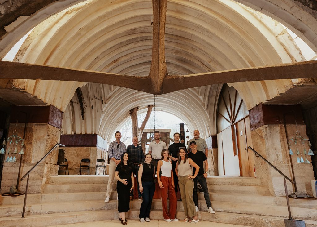
Image: TWR Media Co.
Cosanti – Enchanting Bells & Arcology
“If an architect’s ego is very small, he is done for it; if it is vast then he might make some very important contributions.”
– Paolo Soleri
Although most of this post will be about Mr. Wright, I wanted to talk about the sometimes gravity-defying place that is Cosanti. If you have not been, or just don’t know, and have made it this far in this post, Cosanti is the brainchild of Paolo Soleri. A famed Italian American architect who studied under Frank Lloyd Wright until, you guessed it, there was a fracturing disagreement between them.
Soleri wanted to prioritize interpersonal connection and nature through compact, vertical environments. Wright was infatuated with the sprawling “Broadacre City” that was built and flowed out into nature, allowing people to interact with the landscape itself. Now there is much more history here, and I am vastly condensing their opinions, but before this becomes too much like a third-grade book report, let’s just go ahead and pivot back to lighting. That work for you? Fabulous.
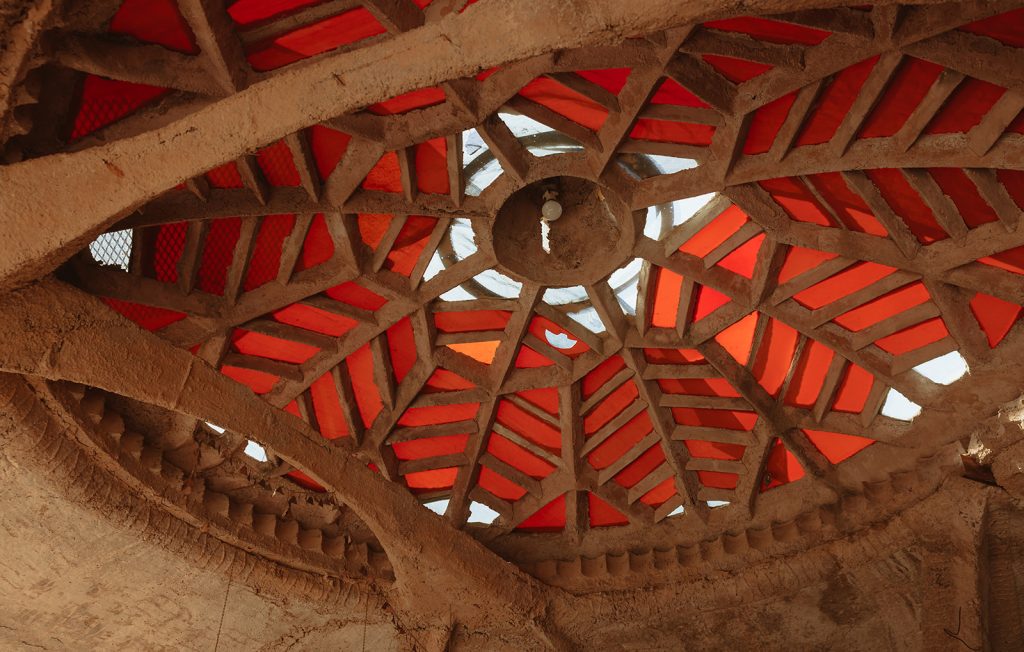
Image: TWR Media Co.
The structures at Cosanti all practice what I would call sun worship. Many of them are half-domes, and they all face south. Why? Well, in the winter, that dome helps funnel light deeper into the space while also capturing some of the heat. In the summer, with the sun being higher, the intense desert heat and light are deflected to keep the space cool. But it does not just stop there, no no, they lined these structures with (what I could make out to be) colored glass bottles between the layers of the structure.
In just the right light in the main pottery studio, the massive apses (a five-dollar word for partial dome) were trimmed with a sparkling light, and I was obsessed with it. This space in particular feels like an earthly Hollywood Bowl from Dune, but from one designer to another, when the time is right, let’s add some sparkle to our buildings.

Image: TWR Media Co.
On With It – Frank Lloyd Wright vs a Lighting Designer
“Form follows function – that has been misunderstood. Form and function should be one, joined in a spiritual union.”
– Frank Lloyd Wright
Let’s keep going.
What did I think of The Biltmore Hotel? It is stunning, and if you can go, please do. Ask for Larry as your guide. He will do a far better job than I will, and I think we should talk about Taliesin West. He will do a far better job than I will, and I think we should talk about Taliesin West; we can come back to this in another post.
Taliesin West. Frank Lloyd Wright’s winter home and studio for both himself and his apprentices for over 20 years. Fast forward to 2021, and Lutron (shout out to Lutron for the trip) works with the Frank Lloyd Wright Foundation to revive this UNESCO World Heritage site to its true light.
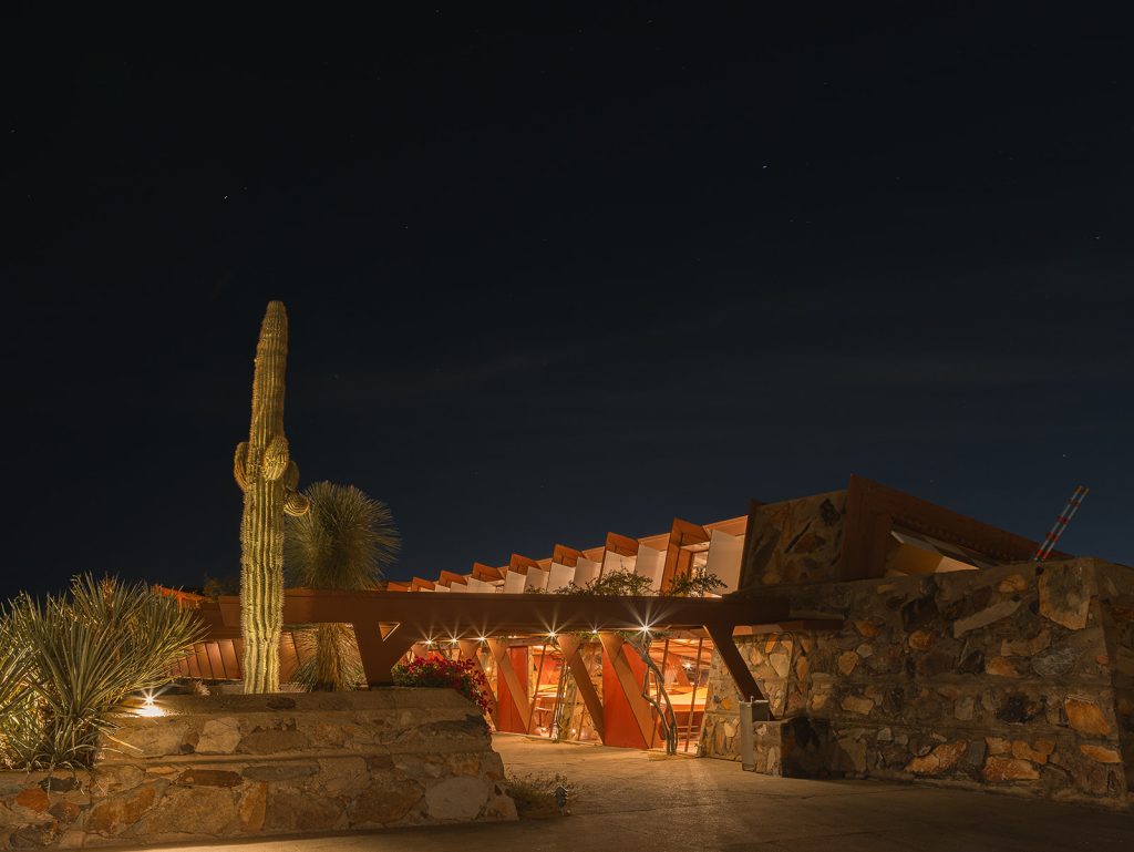
Image: TWR Media Co.
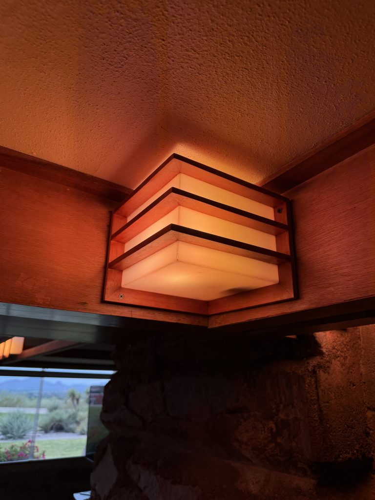
Now, before we get technical, let’s talk about detailing and integrating light. Have you ever seen a wall sconce that is on a sliding track attached to the structure? Because I have. Have you ever seen a pendant extending from the structure, emulating the stepped expression of the mountains surrounding you? Because I have. Have you ever – okay, I’ll stop there, but you are getting the point. Light is an extension of the architecture in his spaces; you cannot pry apart the two.
This very thought extends beyond just electric light as well. There is a rhythmic hypnosis that Wright tamed by merging form with shadow, shifting through the breezeways as the sun moves across the day. That same sun stretches itself across drawn linen shades, diffusing into the perfect, shadowless light in the drafting studio. And the best part of all? Little treats and treasures of concealed light built directly into the architecture, just waiting for night to fall.
It is sometimes hard to look at and break down the concept and care that goes into places like this, especially when it comes to lighting. Far too often, the concepts of “oh, that detail is too fussy, plus it really won’t matter anyway” and “oh, just put a few more downlights over there” are thrown around. Quite frankly, I think Frank would slam the desk if you were one of his students there and suggested that. I do not mean to turn this somewhat light-hearted writing into a more serious tone (even though that is exactly what I am doing and intending), but I share this as almost a call to action. A call to reinvigorate and justify the time spent on curating custom details and fixtures that could live nowhere but exactly where they have been placed.
We live in such an incredible time as designers. We have tools that connect us almost like we are standing side by side. We have technology that has decreased our environmental footprint to astonishing degrees. We have programs that allow us to draw and simulate space, light, and texture with tremendous accuracy. But a part of me feels like, with all these incredible improvements to the tools we use, the technology we have, and the programs we scream at (lovingly), light can still often be seen as a utility, not an expressive necessity.
Quick detour. I promise I am going somewhere with all this, but I need to get a few things off my chest first. Running out a grid of downlights (cans for those needing the NIV version) is not going to do anything but flatten your space and light the floor. For which, it isn’t helpful except for the person installing the floor! Plus…as we all know, sitting under a downlight is oh sooo flattering *rolls eyes. Place them with intention and light the verbs. Oh, and while we’re at it, always have vanity lights (especially in the powder room), use decorative lighting as motivation for architectural lighting, and light the damn art. The art you display is literally an expression of YOUR interests and YOUR eye to anyone you invite in, so share that with them.

A Curated Story is Best Seen In Color
“Beautiful buildings are more than scientific. They are true organisms, spiritually conceived; works of art, using the best technology by inspiration rather than the idiosyncrasies of mere taste or any averaging by the committee mind.
– Frank Lloyd Wright
I’ll jump to it and tell you that this quote speaks to the importance of a single coherent vision. It describes this vision of a single organism where every part belongs to another. Where technology is in service of that vision. And we, as the stewards of that vision, use the best tools available to us because they help the idea of that vision land, not because the tools themselves are the idea. VS. This idea of design assembled by a slew of stakeholders, where each voice is heard. The sharp edges sanded down, all till the building itself becomes a compromise document. Long lost from the vision it once was and the story it may have had.
Great work comes from understanding the story. When we can rally around the story (the vision) that is where design takes root. That is where the definition of success lives. That is also sometimes hard and scary.
As we sit in our seats.
As we all sit eye to eye.
There are moments where we have to defend the story. To each other, to the client, to your co-worker, and sometimes, to yourself.
Color has often been that for me. Colored light is often spoken of as a four-letter word, especially in residential and hospitality work. But yet, it is not, it’s a five-letter word…and in the context of this post, that word is Ketra.
Now I have known about Ketra for quite some time. I knew about Ketra back before Lutron even acquired them, back when it was three dudes out in Austin, TX. And although I do not shy away from sharing with Lutron (on a hot mic) ideas to push and push to improve their products, I do not know of anyone else tackling this specific cornerstone of lighting design. Color. It is not just color temperature folks, and it is not just color filters. It’s the manipulation of undertones to deliberately amplify the color of your subject. Put that on a t-shirt.
I do want to say that this concept is not entirely new and has actually been used in theater and entertainment lighting for quite some time. Years ago, as the high-output lamps often used in bright theatrical fixtures became increasingly scarce and costly, someone had to innovate. Fast forward to now, and LED arrays are well beyond RGBW and are being taken to DRALGCBI (that’s deep red, red, amber, lime, green, cyan, blue, and indigo for those keeping score at home).
“Oh my gosh, that sounds incredible, Kai!” I know, I know, it really is exciting times for light and color, and thank you for making it this far, but there’s one thing I want to add. That theatrical workhorse is a 20lb tank that is over two feet long. When your light has to be made to reasonably fit inside a ceiling, sometimes it takes a bit longer to make its way into our hands. So while Lutron has its challenges set out, I am so glad we are here to see and play in this evolution of light.
What does this use of color actually look like in practice though?
Have you ever wanted to make a hedge wall pop a bit more?
Throw in a slightly green color filter.
Have you ever wished that Hokusai print of yours popped a bit more?
Throw in a slightly blue color filter.
Have you ever wondered why sometimes fresh herbs, apples, and other produce in a grocery store look a bit more…fresh?
Well, the lights that are on them very well may just have a color filter in them that helps boost their appearance. Pretty neat trick huh.
While none of this is new, there seems to be a generally adverse reaction to the word “color” as if subtle is also not right behind it. And if I am being honest, there are times when we often do this but just do not mention it, because the end result is exactly what it should be. But that is why we are here, that is why we all need to have the conversations (or more ramblings on the world wide web that we share with each other), because there is so much to the world of color. Maybe that is another post for the future…
I want to close this with a conversation I had in speaking with the staff at the Frank Lloyd Wright Foundation. The rollout of Ketra throughout the spaces at Taliesin West has been a complete revitalization of what the space was supposed to feel like, how the story was supposed to be read. A revitalization that is still ongoing, with more spaces that are eagerly awaiting their return.
A return to the story of Taliesin West through light.
A return that honors its story.
A return that uses technology driven by the fixation of color to serve that very story.
A return that hands the rest of us a question we should not avoid:
Are we using our tools to tell a story, or are we just using them?
Thank you.
A massive thank you to Lutron, Unified Representatives, Powerfull Systems, and all those who joined to make this trip possible.
Thank you for the conversations and the inspiration.
Cover Image Courtesy of: TWR Media Co.